From Blush to Bold: 17 Colour Palettes to Fall in Love With
- Stacey

- Nov 25, 2025
- 3 min read
Have you been searching for the perfect colour palette for your wedding day? Some things to consider include the season, your venue and the overall style you are looking for. Once your colours are locked in, it makes it so much easier to decide on your florals, decor, bridal party attire, and of course your wedding stationery & signage!
Generally it's a good idea to focus on 1-3 main colours, a neutral and possibly an accent colour that is used sparingly as a highlight or special feature (eg. a touch of gold or a pop of hot pink).
As a stationery designer, I love helping couples bring their ideas to life through colour — from invitations to welcome signs and all the little details in between. So have fun exploring, mix and match, and trust your instincts. Your perfect palette is out there — and it’ll make your day feel truly yours.
Layered Greens: if you are drawn to nature inspired tones and an earthy, organic feel then consider olive, sage, eucalyptus, moss or dark hunter green... there are so many beautiful shades of green to choose from.

Black & White: this one is a classic for a reason. Timeless, elegant, and effortlessly sophisticated. Perfect for modern city weddings, and grand traditional venues.

Jewel Tones: rich colours inspired by precious gems will add depth and drama to your styling. Think ruby red, sapphire blue, emerald green and amethyst purple. Add some metallic touches for a regal feel.

Soft Pastels: light hues of pink, yellow, apricot, lavender, and dusky blue are a popular option for summer and spring weddings, offering sweet, whimsical vibes.

Chocolate: the 2025 Pantone Colour of the Year is Mocha Mousse - and this warm, rich combo evokes feelings of pure elegance for a sophisticated city wedding, especially during the cooler months. Extend on the decadent dessert vibes with some golden caramel or honey tones.

Burgundy, Black & White: this colour combo is ideal for a glamorous winter wedding. The deep red tones will add some romance and warmth to your reception space.

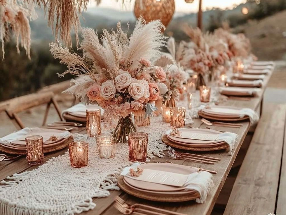
Earthy Boho: incorporate warm tones like cinnamon, cream, terracotta, beige & rose gold. For a gorgeous bohemian feel, pair with lots of texture and embrace your natural landscape.

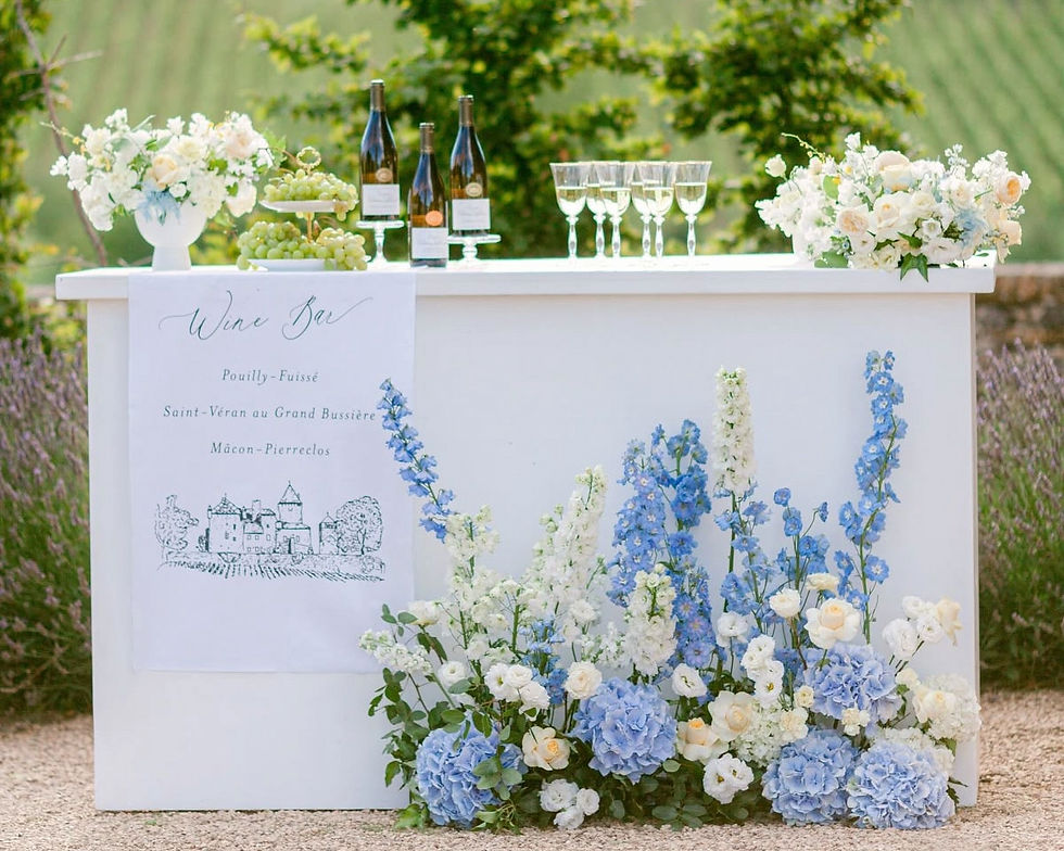
Soft Blue, White & Green : a delicate, considered colour way that highlights romantic serenity & timeless elegance. This fresh colour palette is well suited to coastal and vineyard weddings.

Blush Pink & Rose Gold: for a refined and dreamy wedding aesthetic, this pretty palette could be just what you're searching for. Incorporate these soft colours into an abundance of florals, soft floaty fabric and fine, crystal glassware and it will be like stepping into a fairy tale.

Summer Brights: find inspiration from citrus fruits with touches of lime, lemon & orange for a vibrant and joyful table scape.

Golden: combine touches of shimmery metallic gold with ivory or white, for a classic, sophisticated style. Elevate the look with textured signage (linen, silk or tulle), floaty white ribbons and handmade cotton paper with gold foil printing.

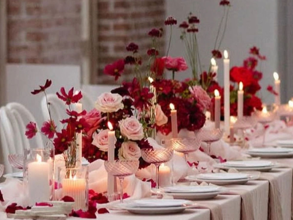
Pink, Red & White: one for the romantics and the valentine's celebrations. Layer different shades, add some sweet bows and get ready to fall in love a million times over!

Sunshine Yellow: calling all spring and summer couples! Yellow evokes feelings of happiness & joy, so why not light up your special day with this happy hue? Whether it's lemon, custard, butter, bright or soft yellow, there are plenty of choices! Go as subtle or bold as you like!

Terracotta & Dusty Blue: this curated earthy colour story is a perfect balance of warm and cool tones. The blue evokes a dreamy, fresh feeling while the sun-kissed terracotta and rust tones add richness and depth to any outdoor, rustic or boho celebration.

Lilac & Lavender: soft purples are always a romantic & ethereal choice, pairing well with neutrals, sage or olive green.

Classic Neutrals: layering different neutral shades such as ivory, taupe & beige creates a timeless, elegant feel that whispers for attention, rather than shouts.

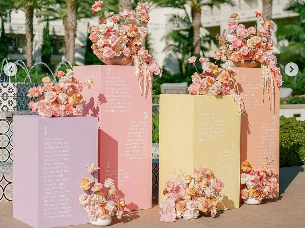
Sweet Sorbet: inspired by summery sorbet hues, this is perfect for couples looking for a fresh, joyful take on modern wedding style. This palette blends pastel pinks, peach, orange and lemon — a delicious mix that feels light and dreamy.

As you explore different wedding colour palettes, remember that your choices should feel like you.
Whether you’re drawn to timeless neutrals, romantic pastels, or bold, unexpected tones, the right palette will bring your love story to life in every detail — from your stationery suite to your flowers and décor.
All images sourced from Pinterest.
Comments